


SPIRAL wrapping paper (2003)
Client: Wacoal Art Center Co., Ltd.
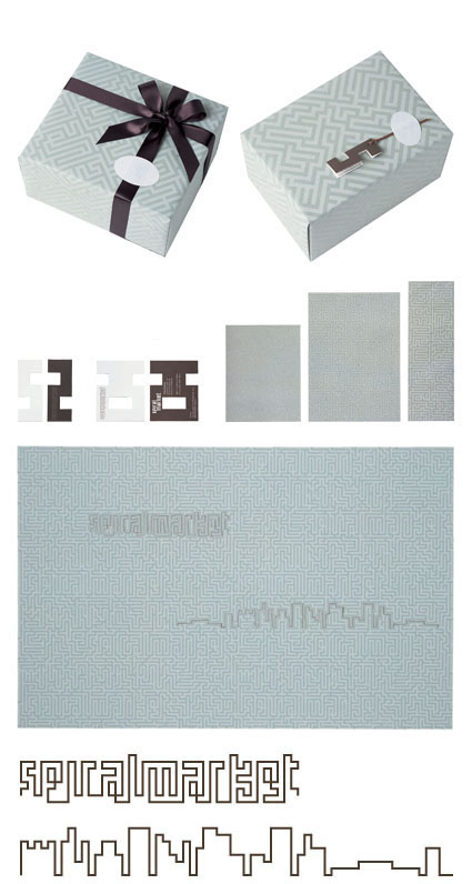
The white lines of the wrapping paper are designed as a labyrinth. Tracing the lines in one area will reveal the shop name, SPIRALMARKET. Tracing them in another, a silhouette of the Aoyama area, with the SPIRAL building in the middle, appears.
An S-shaped tag that goes with the wrapping paper and the shop's card bear an explanation of the labyrinth. The stickers, ribbons, and shopping bags were also made with the same labyrinth theme. Initially, Takahashi thought of making the wrapping paper reversible, with solid gray on one side and a labyrinth on the other, and one of the proposals was actually about how goods could be wrapped using both sides, but the end result was a simple wrapping paper, as you can see in the picture.
The idea of using a labyrinth was formed after her first meeting at SPIRAL, when she was walking home alone with a pen and a memo pad in her hand, trying to draw out an "answer" to her labyrinth approach by sketching some lines first (which eventually became the streets of Aoyama) based on an idea that came to her during the meeting.
Products of Takahashi's original brand line created in collaboration with SPIRALMARKET are available at SPIRAL.