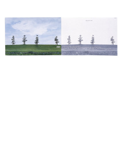
Postcards
(Magazine Dezain No Gemba 2005 New Year's postcard, and four other items) (2004)
Client: Dezain No Gemba Editorial Division
Client: Dezain No Gemba Editorial Division
2005 D&AD (British Design & Art Direction), Graphic Design Category, Bronze Prize
2005 NYADC (New York Art Directors Club), Merit Award
This postcard is designed to create, when combined with the flip side of the same card, a seamless panorama.
When arranged in a circle, they make a 360-degree piece of scenery.
In this period of her career, Takahashi produced many postcard designs which were considered major deviations from the main stream, unprecedented, or a willful disregarding of standards.
Methods of printing a photograph on the entire space and putting different design elements other than simply the address or a single symbolic graphic on the address side are examples of Takahashi's experimental ideas at that time. There are many others, which have become popular ways of expression/presentation today, including postcards without red-framed boxes for zip codes and different designs for the "postage paid" imprints.
Her repeated attempts to expand the boundaries of mail-related products apparently prompted revisions to postal regulations related to letters and postcards.
The postcards she designed in this period, which grew to so many, all present interesting and experimental ideas. Because these are good samples of some of Takahashi's creative ideas, there will be an opportunity to present them in the future on the website.


