


Collage Fur Fur (2004)
Client: Mochida Healthcare Co., Ltd.
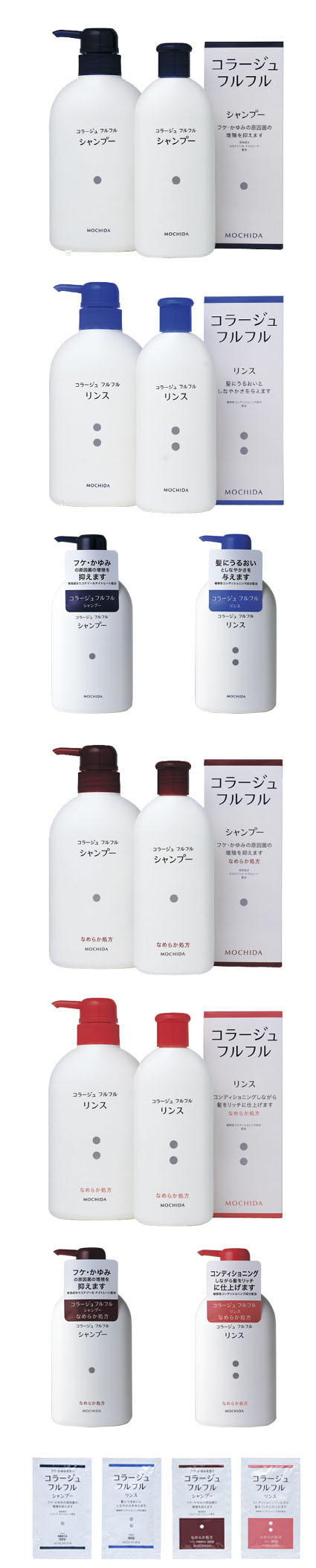
This was a design renewal project for the graphics and text on the bottles and packages for a brand of anti-dandruff, anti-itch shampoo, conditioner, and liquid soap.
Takahashi made the user-centered bottle design itself a packaging concept and incorporated the following ideas:
・ Made the product descriptions "Shampoo" and "Conditioner" larger than the product name. For the outer packaging box, she made these descriptions smaller and the product name larger for customers who would look for the product by name at stores. It is designed so that the words "Shampoo" and "Conditioner" on the outer packaging box appear to become larger when the user removes the bottle from the box.
・The font used for the product name and the description is called Forefinger*, developed for both people with weak eyesight and those who can see well, after extensive research. This font was used here in a commercial product for the first time.
・The bottle nozzle and the body, and the colors of the text, are designed to stay findable/recognizable in a steamy bathroom.
・Takahashi removed the line "Anti-dandruff, anti-itch shampoo" that was on the previous packages and bottles, and turned it into a sticker. Purchasers would see the sticker at the store to learn the type of the product, but could remove it after purchase, so it would not be seen by guests to the house. The removable sticker will also help users not to be reminded of their problems, and eventually stop worrying about them. This set of packages was developed on the basis of what people with dandruff or itchy scalp issues would find helpful and useful.
・The graphics on the product, simple gray dots, are there not only for those with eyesight issues, but also for children who are too young to read, and for non-Japanese users, to know the correct order of use. The shampoo has one dot, the conditioner has two, and the liquid soap has three. It was an attempt to resolve a type of social issue through design.
Takahashi also designed newspaper ads and storefront tools for Collage Fur Fur.
*Forefinger is a font developed by Forefinger Kenkyukai, a group which studies tactile characters, with which Takahashi is affiliated. The font is designed to achieve high legibility when printed as raised characters or as normal text. The Braille literacy rate among the visually impaired is said to be less than 10%, and many totally blind persons acquired blindness later, and were not born with it. Given these facts, the font was designed/developed with tactile considerations based on regular fonts. The legibility of the characters of this font, made to be read with ease, is scientifically verified. The Forefinger font texts on the bottles are helping many people make distinctions between products in steamy bathrooms.