


Omotesando Hills multi-purpose space, "O" (2005)
Client: Mori Building Co., Ltd.
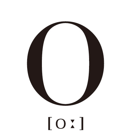
This order came from Mori Building Co. to think of a name and create a logo for a multi-purpose space at Omotesando Hills before the construction of the building.
Of several proposals that Takahashi made, "O" (pronounced "oh") was chosen. (Takahashi thus became the godparent of "O".)
"O" has many meanings:
"O" is the shape of the numeral 0 (zero), which has infinite potential, fuels expectations and provides solutions to problems. "O" is a ring/circle representing the way in which people are connected, people and places are connected, and various worlds are connected with other worlds. "O" is a space where circles of people, connections in the world, and everything else come together circularly. Once that is achieved, it offers an opportunity to think about everything again, starting at point "zero".
Takahashi named the place "O" so that it would become a one-of-a-kind base for external communications which could spread information not only around Omotesando Hills, but also to the whole Omotesando district, all of Tokyo, Japan, the world, and ad infinitum. Under the same concept, she later designed its logo, manuals, and other items.
The manuals have variations of "O" in them, making them look simple and chic, but playful as well.