


Guidebooks 1 & 2 for the Museum of Fine Arts, Gifu (2004)
Client: The Museum of Fine Arts, Gifu
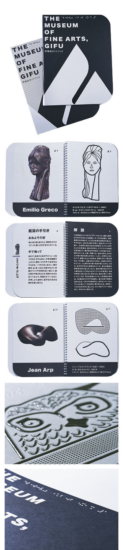
This was Japan's first museum guidebook with tactile features for the visually impaired.
Guidebook 1 was dedicated mainly to sculptures and Guidebook 2 focused mainly on paintings.
The font used for descriptions in the guidebooks was specially chosen and the texts were enlarged as much as possible to cater to people with weak eyesight. Other features included eliminating first-line indents which normally indicate the start of a new paragraph. Instead of using the indentation, gray circles the same size as the text were inserted, without creating a new paragraph, to help users know that new content had begun. This style also saved space so that the larger font could be used without compromising the content. Each page was designed with attention to such small details.
In terms of layout for the artwork, the pages on the left were made three-dimensionally for people with weak eyesight, while the right-hand pages were designed for those totally blind to touch images of the works, reproduced and laid out in such a way that the user could visualize the shape.
The works in the guidebooks were selected from those which visitors most liked to touch, and the covers, which Takahashi chose to be the pages exhibiting the texture of printing, were made in a way that was enjoyable and comfortable to touch.
The guidebooks' strongly-rounded corners functioned as a signal for users to recognize these guidebooks and the whole structure was designed with consideration for people with eyesight issues. These became the country's first such publications and are now serving as "textbooks" for making books with tactile features.